What design tools do we use?
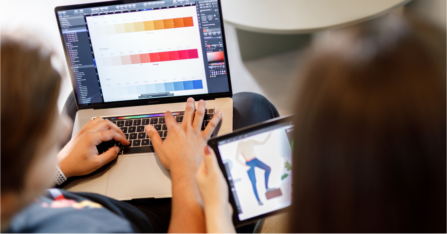
As the design team of Atolye15, we benefit from a lot of design tools when creating interfaces and user experience. These tools sometimes make our work easier and sometimes help us vision the most realistic version of our desired design. Then let’s get to know these tools together!
Figma
If you’ve asked a couple years back, we couldn’t stop talking about possibilities we have using Sketch but now Figma set the bar very high and made us meet a new community.
Figma is a web based app where you can build your interface designs and share these designs with developers, without the need for 3rd party software. Even if it has a desktop version, we actually know that it also works web based. Figma has a lot of features that mesmerizes you, even a single small square you draw will end up being stored on a cloud environment and makes it possible to back up every phase of your project.
Advantages
- Being a web based app, it automatically saves your projects and backs up on cloud.
- Provides a suitable work environment among design and development teams. You can track anyone’s custor while they are working on the project.
- It can turn your drawings into modular versions thanks to its component and variant features and makes it possible to use same features for different purposes.
- All features provided by tools like Invision, Zeplin and Marvel are included in Figma.
- You can create basic prototypes and everyone with the access can comment on specific areas and pass on the revisions for to-do’s.
- You can build responsive structures for all screens thanks to the Auto Layout features. (Pioneer app to provide these services without a need for 3rd party apps)
- Thanks to being a web based app, it does not interfere with the performance of your laptop much, and it performs very fluently.
- You can access free fonts (like Google fonts)
- You can share your plugins and your files with the Figma community freely.
- Almost each month we hear about new features and we’re glad to test them out on their beta updates.
Disadvantages
- Web based softwares has ram limitations. This leads to some exporting problems due to overuse of ram when you try to save your project to your computer.
- You’ll lose access when you do not have an internet connection or if it’s weak.
- If somehow there is a problem with Figma’s services or they convert to a high price policy, all your files can be at risk and cause financial problems.
- You cannot optimize images easily (Creating another copy of a project causes images to shrink)
- The feedback from the Figma quality team when you want to publish a new plugin is not very fast.

Principle
You do not need coding to experience your designs. Principle is a great prototyping tool for you, working in harmony with Figma and Sketch. You can build the whole experience there, show demos to your clients or share who you’d want the app to feel like with your development team. Thisi way you can both scale user experience and get feedback and at the same time, create your animations. You can present your designs as videos and can make a reel out of it to display on the platforms you use.
Advantages
- Support for Figma and Sketch works better than expected.
- Creating animations is easier than other apps thanks to its simple interface.
- Not only interfaces, you can also create lots of different animations and you can export them as MP4, GIF and ProRes.
- With its mobile app you can upload your prototypes to your device and experience your designs.
- Cursor support enables you to select amongst touch, arrow and none, to make sure your export makes more sense.
- You can manage your video export on any scale you want to meet various platforms’ publishing rules.
- You can back up your Principle projects on the web and share them.
Disadvantages
- Working with a lot of layers in your project is hard since the animations are based on the names of the layers. Detailed projects require more effort to carefully select names for all layers. We think that it would be a lot easier if we could transport them on a component basis. You can only create components after you upload your screens, which is still a solution even if it takes more time and effort.
- You do not have the option to change the resolution after you upload the project screens. Therefore, the sizes are a lot bigger than expected when you export 3x screens leading to exports with huge sizes. There isn’t a solution to fix or diminish the export sizes yet, if you do not go for 3rd party software.
- We’d love it if we’d have mockup support for video exports.
Procreate
Procreate has been very popular recently to make great drawings on iPad. Of course the popularity comes from being a successful app. Procreate has already left Adobe Illustrator behind, making it possible to create basic wireframes and if you’re very good with it, you can create UI designs as well. Even though you need some habits to do that, there are no fundamental issues standing in the way of that.
Advantages
- Has a lot of brush options and needless to say, you can upload more.
- If you download font files on your device, you can add those to your Procreate app.
- You can buy it once and it is yours for life.
- When you open up a new canvas, you can make a video record at the very second and share them however you like.
- Supports keyboards.
- You can drag and drop images from different apps.
- You can export PSD, PDF, JPEG, PNG, TIFF, GIF, MP4, HEVC files. We value PSD and PDF support a lot since you can continue your drawings on your desktop.
Disadvantages
- You naturally expect Procreate Folio to serve as a Figma Community but there isn’t a proper working system on that side. Therefore the extra brushes you want are a lot harder than you think.
- It would be nice to see the name of the layer somehow drawing on the interface. For newbies, it may cause mistakes on the layers you draw.
- Some features like adding texts could be placed better on the interface. Surely it is our perspective depending on our experience with the tool.
- They can change the interface according to the purpose of usage like Illustrator and Photoshop and by the help of that, they can serve better to their user target. The work they do is so much better in comparison to the other apps and that’s why we are hoping to see some kind of a feature like this.
Eva Design System: Deep learning color generator
Colors are crucial when it comes to interface design and the harmony of these colors can be perceived differently from one person to another. Eva Colors support us immensely on this matter and even if it is not the same, it is very effective on setting colors at the beginning.
Advantages
- Thanks to “Deep learning” infrastructure, it makes basic color usage ready for you when setting primary colors.
- You can export JPEG and JSON.
- You can set the colors according to your base mood thanks to its dark and light mode. It makes your color preferences easier.
Disadvantages
- We think that the colouring processes could be done faster by adding little plugins to Figma or Sketch. You can always develop the plugin with JSON data but we are not sure if the effort is worth it.
- Deep learning can cause color matches that do not make sense for the intermediary colors sometimes. You have to do some final touches to make it work.
Marvel
We prefer Marvel rather than Figma to benefit from its ease coordinating with our project managers, and also to prepare basic prototypes for our designs. It’s a lot safer for us to not let outer access mess with our system and also be able to test it again with our clients.
Advantages
- You can upload your projects directly as JPG, PNG.
- In case of an update, the only need is to have the same file name.
- You can automatically place designs on your phone and choose the device that is suitable.
- You can give effects with animations and make it look a lot more professional.
- You can test your prototypes with the mobile app.
- You can track user behaviour with the help of its test features, and test them before announcing them to bigger crowds.
- If you are using Sketch, you can view the basic coding styles for development teams.
- You can work in sync with Jira, Youtube, Dropbox and many other apps.
Disadvantages
- We cannot actively use many of its features since it does not support Figma. This is a minus for us but is also a plus for keeping things simple for our project managers.
Adobe Creative Cloud
There’s obviously no need to mention all programs. We use Photoshop and Illustrator a lot of times but in general Adobe Fonts match our expectations very well and from our desired device, we can reach various fonts.
Advantages
- With Creative Cloud subscription, you can access all Adobe products (including iPad)
- It’s very pleasant for us to use our standard software that we’re used to.
- You can back up your project drafts and any file on cloud.
Disadvantages
- They’re a little slow when compared to new softwares.
- Due to problems with the software, there might be issues with Creative Cloud processor and ram. We could literally put devices in the fridge! Do not let Creative Cloud open on your laptop when starting your device.
And more
We definitely love to try new technologies occasionally. We care a lot about adapting to newly developed technologies and experiencing a lot of software’s closed beta processes. As the design team of Atolye15, we are very keen on our R&D studies and we are always here for you to share with you our experiences and comments. Stay tuned for our upcoming news and posts!


